Moovit
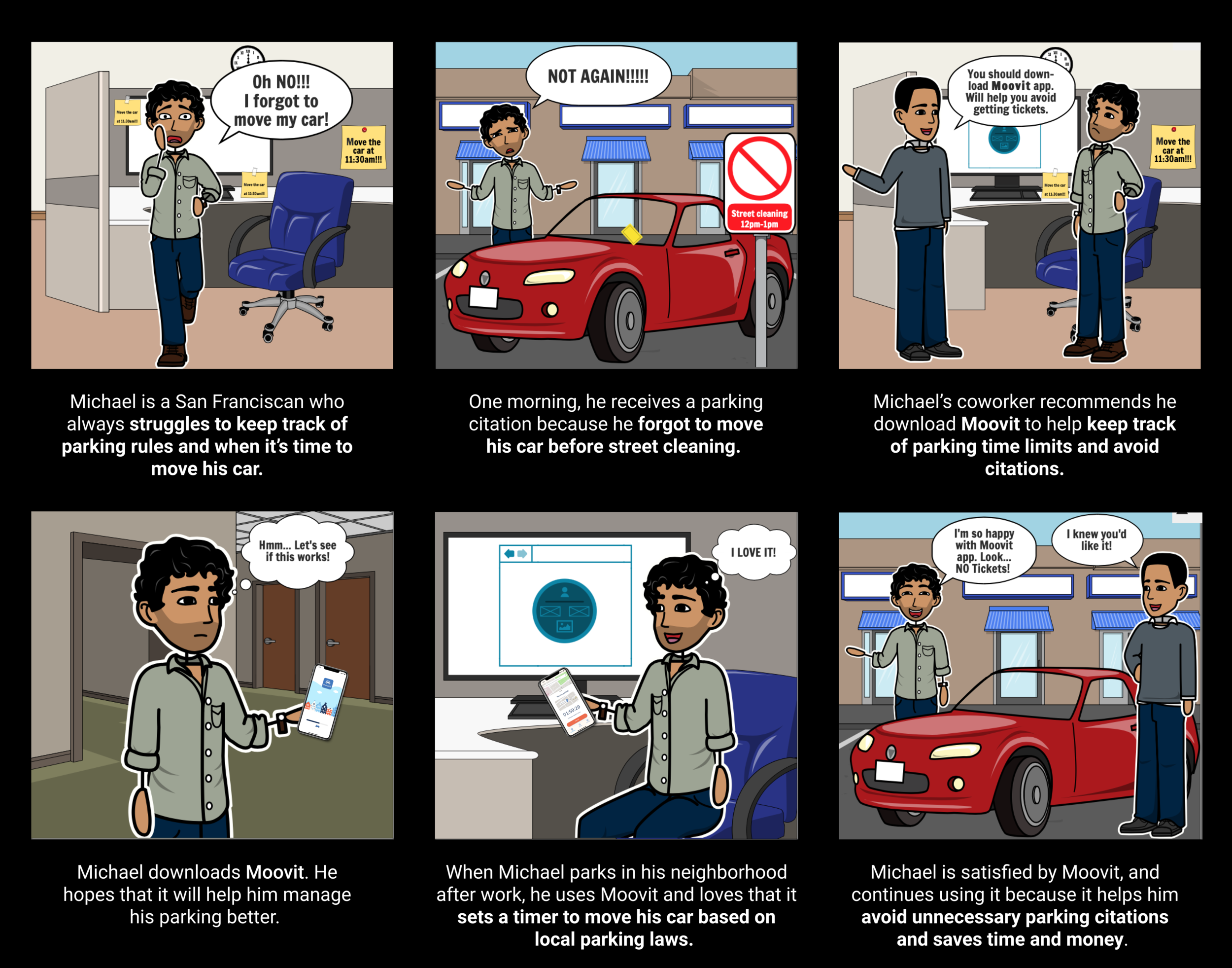
People hate parking tickets! In this project we want to help people avoid them. We are aiming to design a mobile app that uses GPS tracking to detect a user’s parking location and remind them when it’s time to move their car. The app would help both locals and visitors avoid citations by alerting them of street parking laws wherever their car is located.
My Role
Research, UI/UX Designer
I worked as a user researcher with four other designers. Conducting interviews, administering surveys, developing the empathy map, Storyboard, sketching & wire-framing.
Time Frame: Three Weeks
Tools Used: Figma, Miro, InVision
The Inspiration/ Motivation
Inspired by our own experiences, our application’s goal is to help people avoid parking tickets and stressful car-related experiences such as forgetting where they parked, getting towed, or not understanding confusing parking signs.
User Insight
In order to learn about other people experiences receiving parking tickets, We shared a survey about urban parking experiences and received 232 responses.
Human error is a common reason for receiving parking tickets.
61.7% of users received parking citations in the past due to forgetting to move their car on time. They also commonly use faulty tactics including memory and timers to avoid citations.
Problem Statment
Drivers need improved access to up-to-date parking information, as well as reminders to move their cars, in order to help them avoid costly, frustrating parking citations.
“I personally prefer to park in parking garages to avoid receiving parking citations in unfamiliar areas.”
— M (an urban areas driver.)
After collecting all our user interviews and survey data, we organized it into an Affinity Diagram.
User Pain points
Some of the streets doesn't have clear parking rules
Forgets when he needs to move his car because he's always in
a rush when parking
Always getting parking tickets
User Goals
To be better about remembering to move his car before street parking
Find available parking in his neighborhood or wherever he is driving to
Needs to remember to move his car before he gets a ticket during street cleaning
How might we...build an app that saves drivers stress, time and money?
We brainstormed possible features using the I Like, I Wish, What If method, and then decided on key features with Dot Voting.
Prototyping & User Testing:
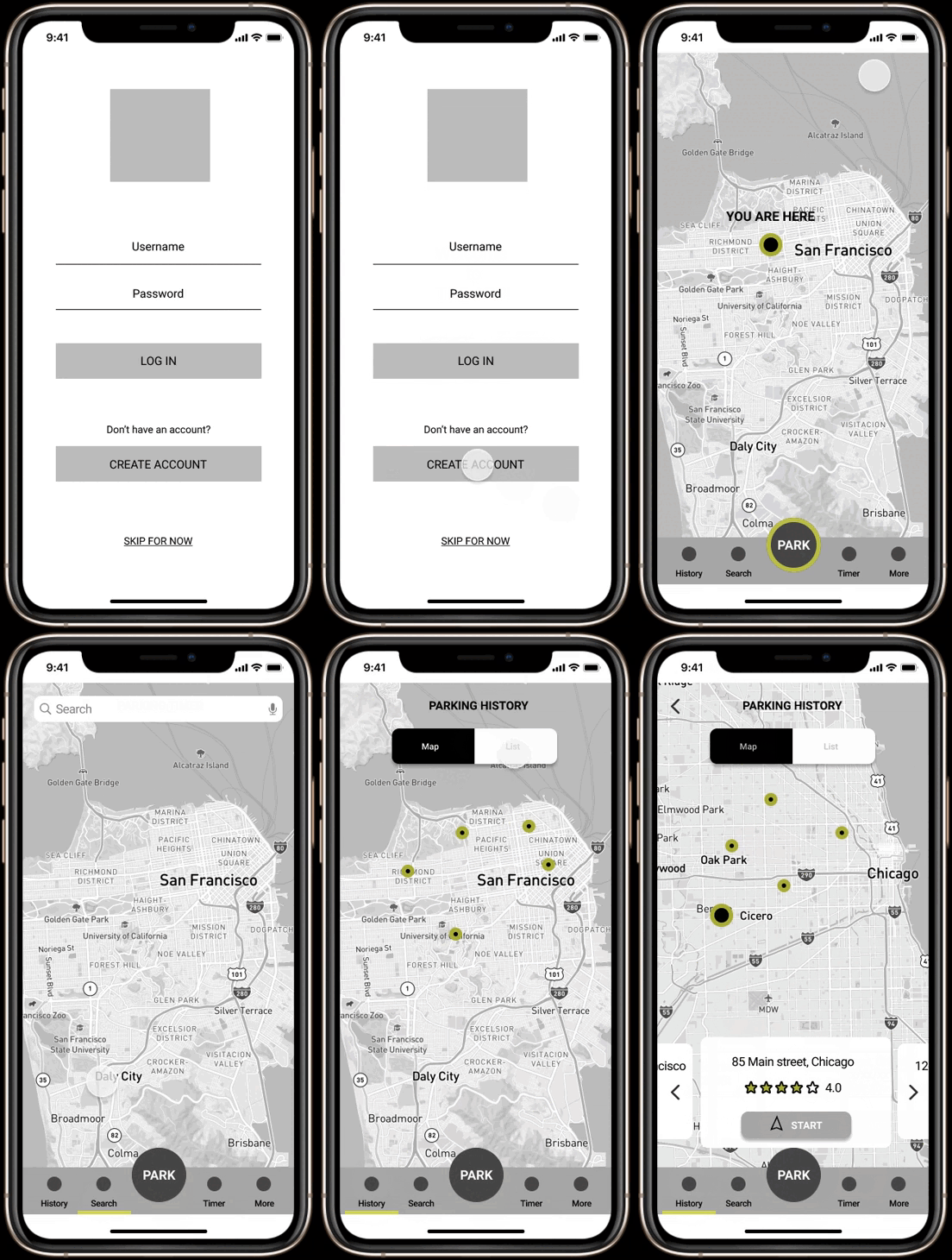
Low Fidelity Wireframes & Prototype
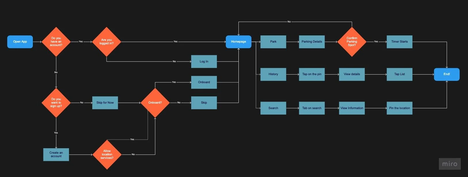
Once user flow had been established, We began to build out the key pages that would be needed to create the new App. Low fidelity Prototype
Home
We decided on the layout with the visible Park button, part of navigation bar.
Timer
Screen that shows the time until user need to move their car.
Search
Users are able to search for the address that they are planning to visit to learn about parking rules in the area in advance.
History
Users are able to save their favorite location if they have an account.
Lo-fi User Testing Plan
We tested five adults on their ability to complete a set of three tasks.
Tasks Include:
Park car, read parking details, and confirm parking spot.
Search for parking details about 123 Main Street.
Grow it.Use history feature to get directions to a previous
parking spot.
Lo-fi User Testing Results
Testing was overall successful, and the prototype well-received.
Feedback included:
Park feature was effective. Users appreciated the details and automatic timer.
Map should be zoomed more in to show streets in detail.
History’s map and list toggle was difficult to navigate.
Users found UI pleasant and intuitive.
High-Fidelity Wireframes & Prototype
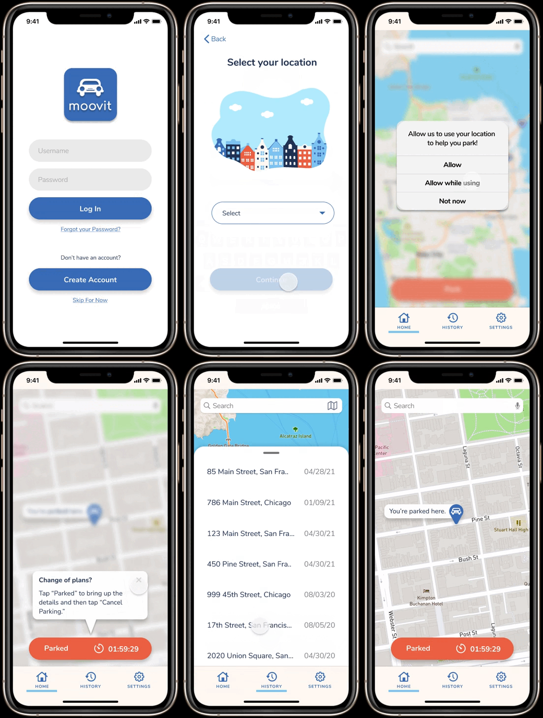
After we finished designing screens that are necessary for users to finish tasks, we linked those pages using Figma and created a high-fidelity prototype for usability testing. Conducting usability testing using a high-fidelity prototype is useful for detecting issues in information architecture and flows that generate frictions for users. Hi-Fi Prototype
Home
This screen is the first screen that user will see after onboarding. App will locate them on the map.
Timer
After user click on Park, they are able to see the parking rules. They should click confirm to be able to activate their time. After confirming the details, timer starts the count down.
We changed the Timer screen after our Lo-fi testing because user were not able to use the app when timer was on.
Parked
We added this screen after Lo-fi usability testing to give this option to our users that when they are clicking outside the parked card, they are able to use the app and still able to see the timer on their screen.
History
Since toggle between map and list was difficult to navigate for our users, we decided to make some changes for this screen. Users can use their parking history with using the map as well as list option.
Hi-fi User Testing Plan
During this round of testing, we tested five adults on their ability to complete four tasks - this time including account creation and onboarding as well.
Tasks Include:
Create an account, select location and select parking permit type.
Use park feature, read parking details, and confirm parking spot.
Search for parking details about 123 Main Street.
Use history feature to get directions to a previous
parking spot.
Hi-fi User Testing Results
Overall, our users had a 100% task completion rate and provided positive feedback.
Some additional feedback included:
Verbiage of some content and parking details was confusing at first and required a re-read.
Onboarding pop-up placement within user flow was helpful to some, confusing to others.
Reading parking signs was difficult because of small size.
Next Steps
Rephrase wording across app, specifically in instructions and parking information.
Update onboarding pop-up flows to ensure smooth transitions from one step to another.
Add a peak hours feature for users to view general availability in certain parking areas.
Add parking zones to map that represents metered parking, street parking,
and reserved parking.Build out alternate language options within accessibility settings.
Build smart watch interface for easy, on-the-go parking and additional iOS alert designs.


