Farming Hope
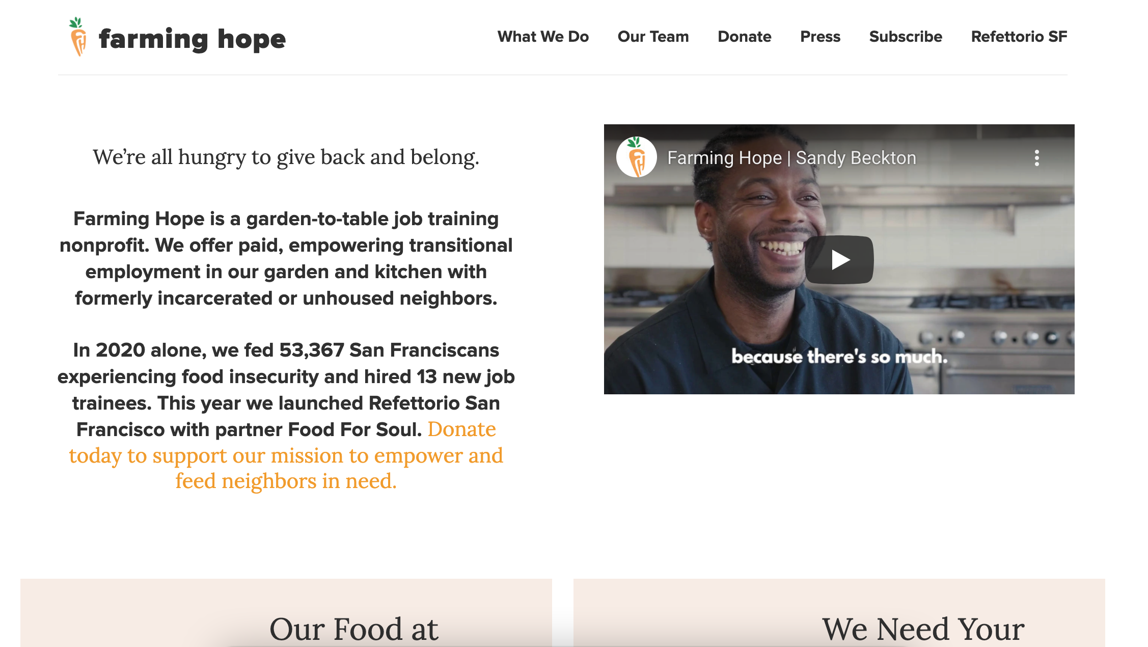
Farming Hope is a garden-to-table job training nonprofit located in San Francisco, CA. They offer paid, empowering transitional employment in their garden and kitchen with formerly incarcerated or unhoused neighbors.
My Role
Research, UI/UX Designer
Collaborated with four other students to conduct user research and to design an improved user interface for web to promoting the organization.
Time Frame: Three Weeks
Tools Used: Figma, Miro, InVision, Lucid Chart, Trello.
The Problem
Farming Hope’s website is not effective enough at promoting information about the organization and needs to attract more donors.
The Solution
A website redesign that inspires individuals to donate through accessible layout of information and motivational imagery based on user research.
Interview Plan
As user researchers, we want to understand how people feel about volunteering/ donating to local non-profit organizations.
Research Objective
To discover the main factors that inspire individuals to donate (time/ money)
to an organization
To figure out how people normally find organizations to support (Through work, word of mouth, searching online, etc)
To find out if people are influenced by values when volunteering/donating?
Client Interview
We Interviewed Jamie Stark, Executive Director & Laurence Feygin, Operations Director to understand what they want for their website to focus on.
Needs:
Promote donations more than volunteer
Building out a social enterprise component to their organization
Emphasize food photos more than currently
Add staff imagery and bios
Create an one-pager website
“I love being able to see images of the people I helped. It feels great knowing that my time and energy have been put to good use.”
— PARKER
Competitor Analysis
Many organizations include statistics and videos on their sites.
Farming Hope needs to add an annual report to their website
Survey Results
User Persona
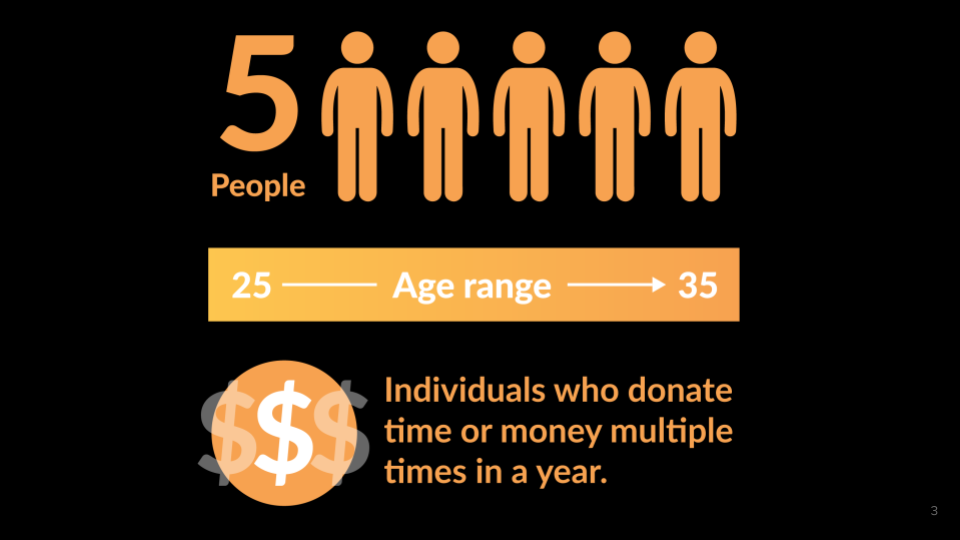
Since we have gathered a bunch of knowledge of the donors, as well as their goals and needs, we use the user persona to represent key audience segments. It helps us focus on tackling the most important problems – to address the major needs of the most important user groups.
Let’s meet Harper, a Program Manager in San Francisco. She wants to find a way to give back to the city in which she lives.
Problem Statement
Farming Hope offers paid, empowering transitional employment in their kitchens with formerly incarcerated or unhoused neighbors. We have observed that their website isn’t effectively communicating the impact donors directly make, causing a lack of potential donations and support.
How might we… improve Farming Hope’s digital representation so that more donors are willing to support their mission based on number of new monthly donors and increase of returning donors?
User flow - Donation
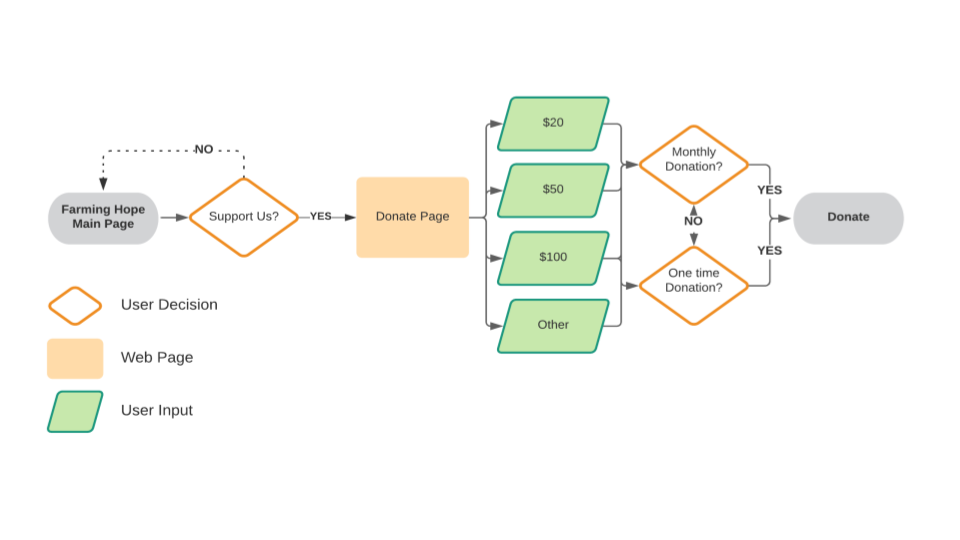
This process helps us walk in an individual user's shoes, and think through different scenarios that this user might encounter. Below is the user flow for Harper when she wants to Donate to Farming Hope. A complete user flow can be viewed here.
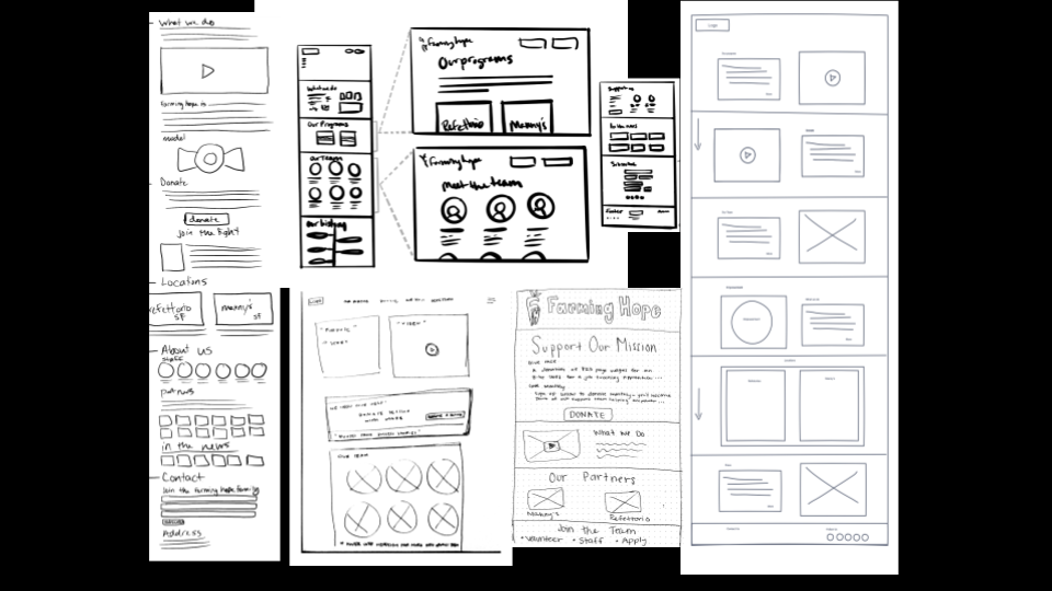
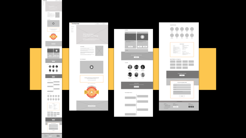
Low Fidelity Wireframes & Prototype
Once we had a visual direction of the layout, we started to add more details and precisions to the sketches by turning them into mid-fidelity wireframes. Creating mid-fidelity wireframes helps us focus on the visual consistency and hierarchy before applying styles. In these wireframes, we tried to incorporate common design patterns that have been tested on our competitors' product, or included elements that directly address users' goals, needs, frustrations, and motivations.
Lo-Fi User Testing Plan
3 Tests
Tasks completed: 7/9
Takeaways:
Layout of donation page was confusing
Need to make “Press” its own section, users not clear on website scroll feature
Tasks Include:
Locate a news article on their site
Subscribe to their newsletter
Give money to the organization
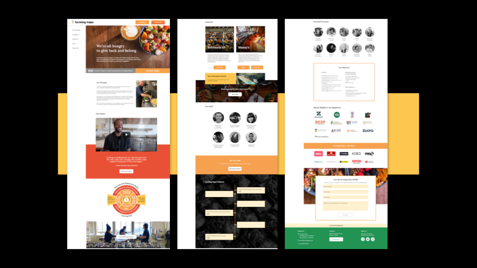
High-Fidelity Wireframes & Prototype
We created high-fidelity wireframes by applying established styles. It further lets us to examine the overall aesthetic feelings and visual balance of the website.
Hi-Fi User Testing Plan
4 Tests
Tasks completed: 12/12
Takeaways:
Some fonts were too small and easily ignored
Too much white space on the Donation Page
“Support Us” needed to be changed to “Donate”
Tasks Include:
Locate a news article on their site
Subscribe to their newsletter
Give money to the organization
KPIs
Number of donations
Percentage of visitors that donate
Amount of users who subscribe to the newsletter
Number of orders made through the website
Next Steps
Our client reviewed our work, and they liked what we designed for them.
We are currently working with our client on this project to finalize everything before go live for public.
Develop the “Eat with Us” page to start collecting catering orders.


