EDD Re-design
The Employment Development Department (EDD) offers a wide variety of services such as Unemployment Insurance, jobs, and training, etc. Our user utilizes the EDD website because she lost her job due to COVID-19. She uses this government agency to access her unemployment insurance benefit every other week.
My Role
Research, UI Designer
Collaborate with another student to conduct user research, and to design an improved user interface for web.
Time Frame: Three Weeks
Tools Used: Figma, Miro, InVision, Adobe XD, Webflow
Project
Improve the usability of the California EDD website
The solution
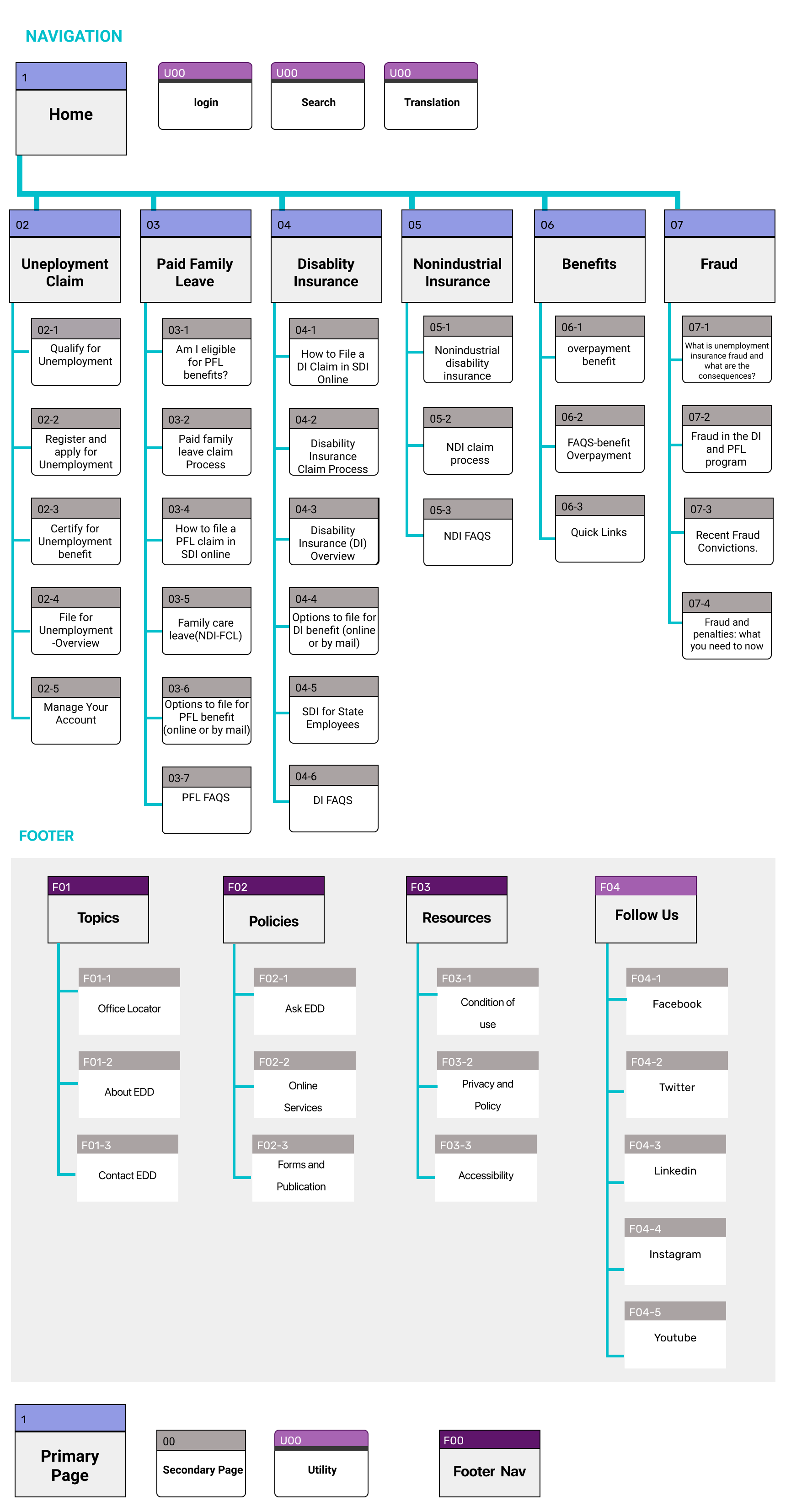
Redesign the website by integrating new UI components to provide users better experience to use the website. Our goal was to improve the usability for users by streamlining navigation and decluttering content.
The Challenge
Layouts:
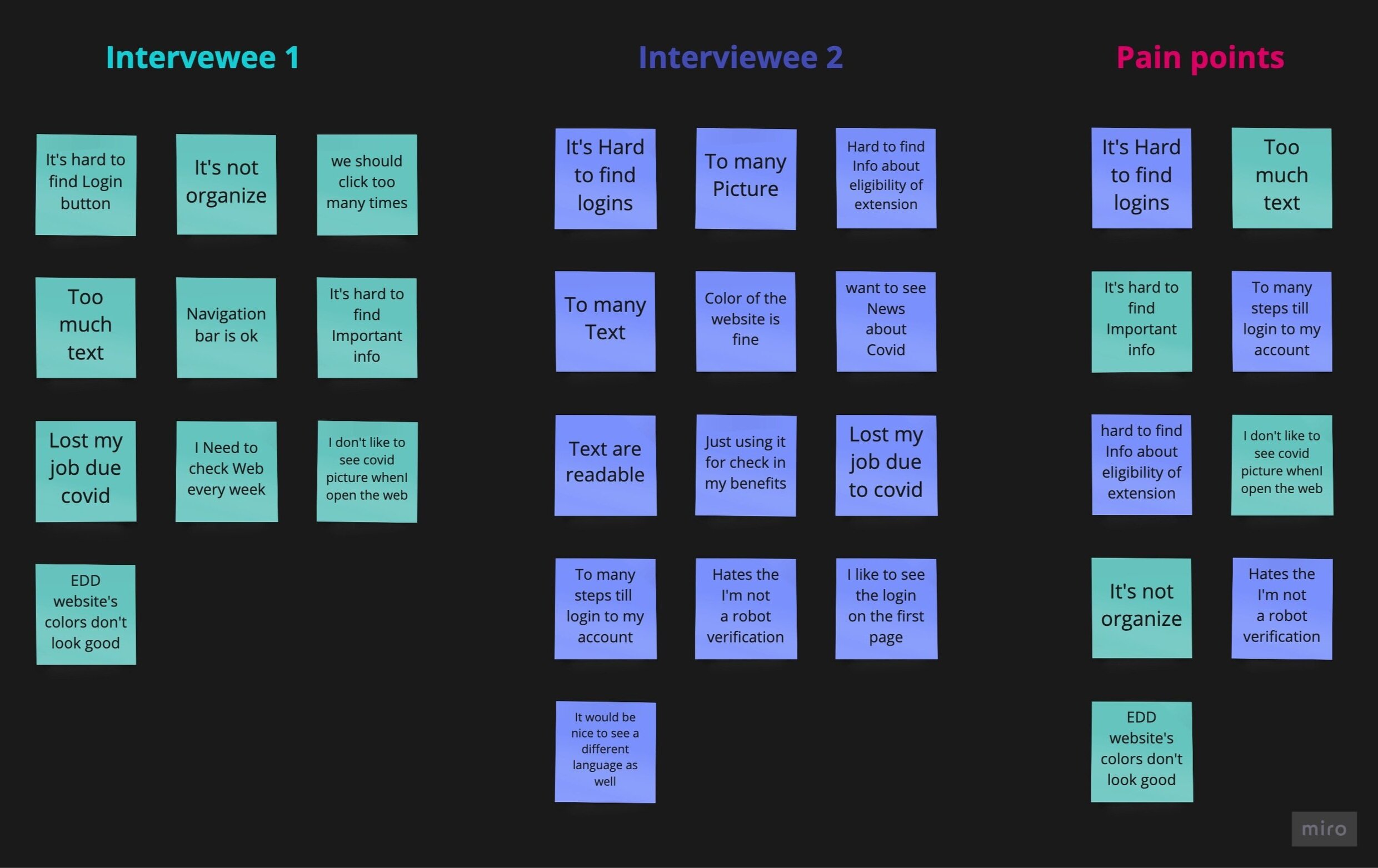
Confusing layouts and lots of unnecessary steps to login each time.
Content:
The EDD website displays too much information when users are trying to discover right information about the clams that they are looking for.
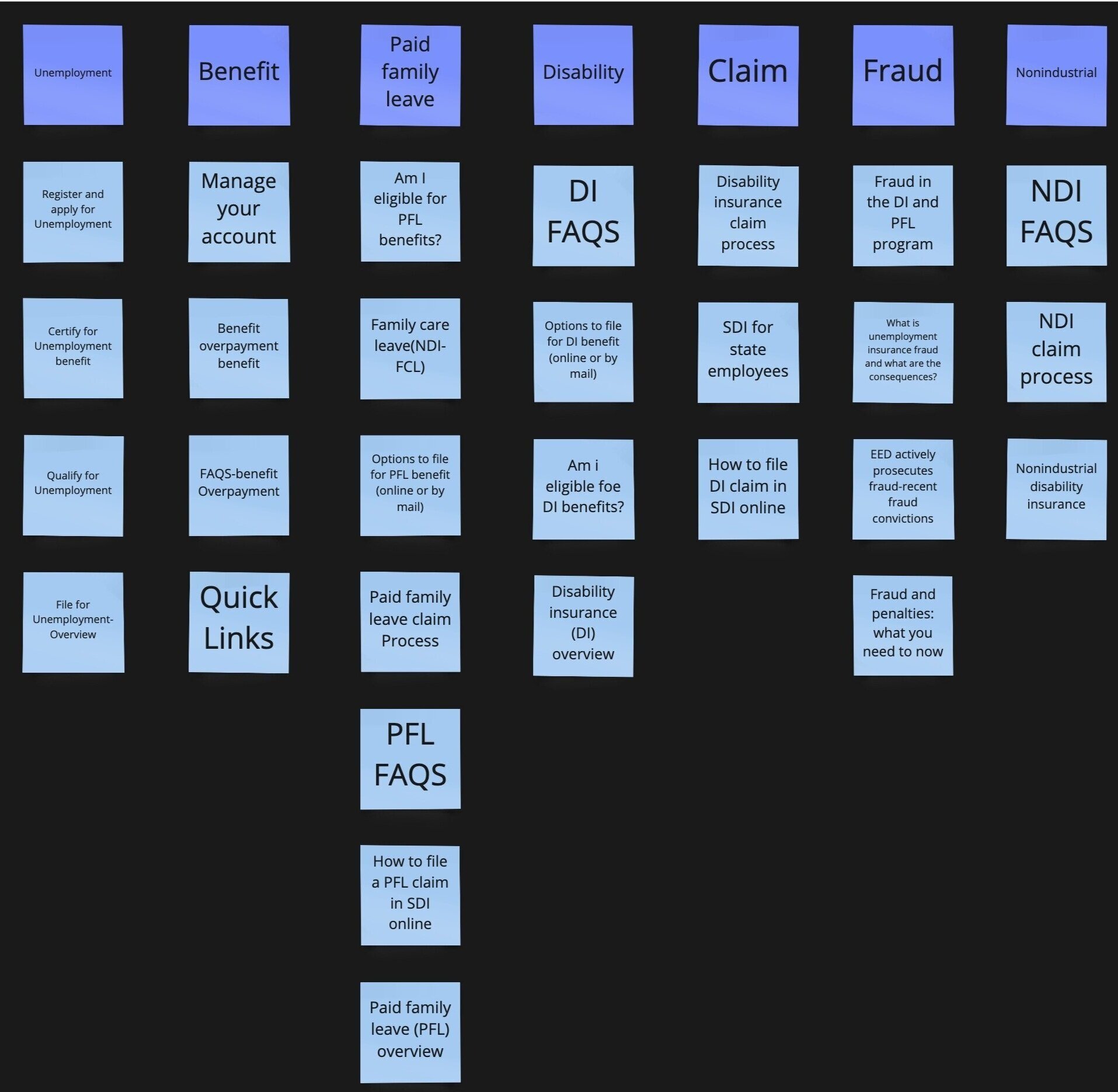
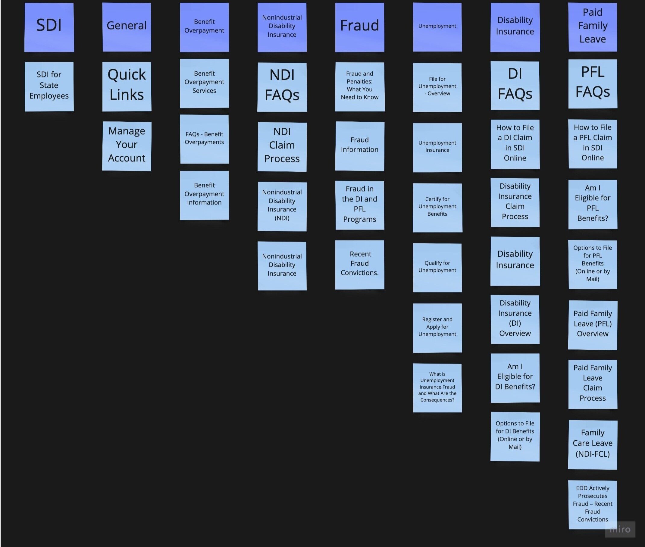
Sitemap card sorting
User #1
User #2
User Persona
Since we have gathered a bunch of knowledge of the audience, as well as their goals and needs, we use the user persona to represent key audience segments. It helps us focus on tackling the most important problems – to address the major needs of the most important user groups.
Let’s meet Cindy Marks, a Sales Associate in Bay Area. She lost her job due to Pandemic, now she has to use EDD website for the first time to be able to get her benefits.
A & B Testing
Before we moving to our low fidelity wireframing, we created 2 different version of main page only to run 5 sec test to see which one is easier to use for users. One of the best feature that original EDD website has is Translation option in the footer. Based off our research we found out that 41.2% of Californians are not English speakers. That is why we decided to bring the Translation to Utility section to be more accessible to all the users who use EDD.ca.gov.
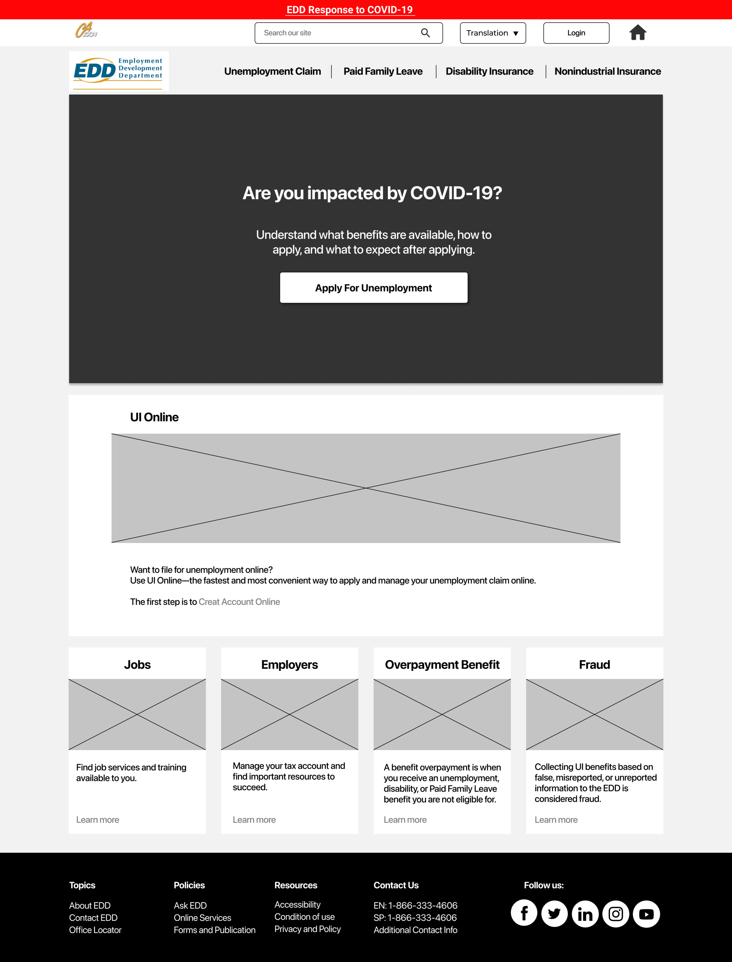
Version A: In this version we kept the original EDD navigation bar. The main changes that we made was, we added Multilingual Resources & Home to the Utility section. Also, moved the Log in next to the Navigation bar to be more accessible and the rest of page is similar information as the original website.
Five-second usability test
Note for A testing
Search is Big!
Too much information on the first page
EDD response is good and bold enough to find
Titles on the bottom is confusing
Note For B testing
You can tell what is the purpose of the website.
“UI online” for someone who don’t know what UI is as abbreviation is confusing.
A phone or email on the footer for immediate contact is nice.
Lo-Fi Prototype
Clickable Prototype link Available Here
UI Style Guide
Hi-Fi Prototype
For High Fidelity we re-designed the EDD logo, because the original EDD logo was not matching with our styles and designs.
Clickable Prototype link Available Here
Hi-Fi Mobile Version
When we finished with Desktop version we created a few screens for Mobile version to show how we want to present our navigation in Mobile.
Clickable Prototype link Available Here
Next Steps
Finish creating the rest of the pages for desktop.
Ability for user to see previous and current submissions.
Do more iterations on mobile and tablet.
Recent News section.
More accessibility testing.


